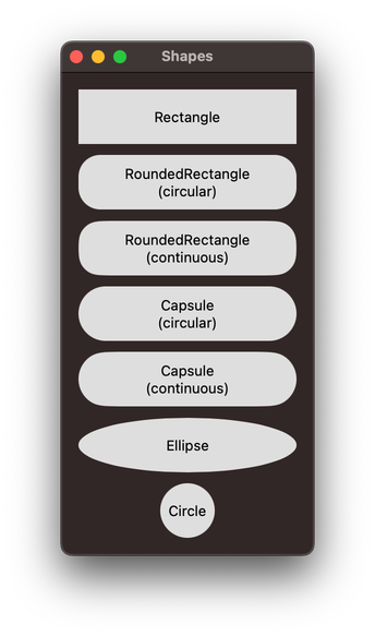
What do SwiftUI’s built-in shapes look like?
Today I learnt …
Apple’s declarative UI framework, SwiftUI, allows you to easily draw several different shapes:
RectangleRoundedRectangle(with a continuous or circular corner style)CapsuleEllipseCircle(with a continuous or circular corner style)
Apple’s famous for its poor developer documentation, and here’s just one more example: although the documentation lists the names of the shapes you can draw, it doesn’t actually show you what they look like. Quite an oversight. So to fill just one small hole in Apple’s documentation — so we can all see how the shapes look — I made a MacOS app to draw all the shapes. Here’s a screenshot:

For posterity, here’s the code for the View that creates that window:
struct ContentView: View {
var body: some View {
VStack {
ZStack {
Rectangle()
.frame(width: 200, height: 50)
Text()
.foregroundColor(.black)
}
ZStack {
RoundedRectangle(cornerRadius: 20, style: .circular)
.frame(width: 200, height: 50)
Text()
.foregroundColor(.black)
.multilineTextAlignment(.center)
}
ZStack {
RoundedRectangle(cornerRadius: 20, style: .continuous)
.frame(width: 200, height: 50)
Text()
.foregroundColor(.black)
.multilineTextAlignment(.center)
}
ZStack {
Capsule(style: .circular)
.frame(width: 200, height: 50)
Text()
.foregroundColor(.black)
.multilineTextAlignment(.center)
}
ZStack {
Capsule(style: .continuous)
.frame(width: 200, height: 50)
Text()
.foregroundColor(.black)
.multilineTextAlignment(.center)
}
ZStack {
Ellipse()
.frame(width: 200, height: 50)
Text()
.foregroundColor(.black)
}
ZStack {
Circle()
.frame(width: 200, height: 50)
Text()
.foregroundColor(.black)
}
}
.padding()
}
}
Thumbnail image from MagicPattern on Unsplash.