Visualisations
The 13 pages that I, in my great wisdom, have decided have something to do with ‘Visualisations’. Whatever that is
-
How Leicester City failed to reach 100 points
Visualisations
Leicester City experienced a bumpy season after their relegation from the Premier League. Despite a new manager, successful squad changes, and early dominance in the Championship, they ultimately failed to reach triple figures. Why?

-
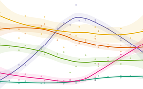
Election fever in Iceland: a presidential race too close to call
Visualisations
As Icelanders head to the polls, four leading candidates compete in an unpredictable election
-
When was Red Dwarf at its best?
Visualisations
The long-running and much-loved TV series has seen its highs and lows, but are its best days behind it? You know what we do here: explore the data to find out

-
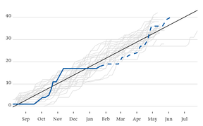
Are Leicester City in a relegation battle?
Visualisations
Will City end the 2022/23 season in the bottom three of the Premier League? Let’s see how City’s points so far this season compare to previous seasons’ relegated teams
-
How do Covid cases in Iceland compare to Britain?
Data
Looking at the seven-day rolling rate of new cases per 100,000 population in Iceland and the United Kingdom

-
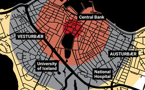
What if it were our city?
Maps
What impact would the Fat Man atomic bomb, dropped on Nagasaki in 1945, have on modern-day Reykjavík?
-
Which planet is closest to Earth?
Visualisations
The BBC’s Sky at Night programme said our nearest neighbour is Mars but one viewer disagreed. Was he right? Let’s find the answer using Python and R

-
The rise and fall in support for British political parties
Visualisations
How the distribution of the popular vote has been shared between Britain’s main political parties since the 1950s

-
From village to city: the evolution of Reykjavík
Maps
Using open data to track 140 years of growth in Iceland’s capital city

-
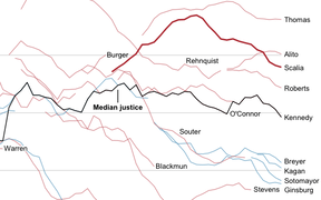
How Antonin Scalia compared with other Supreme Court justices
Visualisations
Charting the swing vote in the US Supreme Court, and finding a flaw in the New York Times while we’re at it
-
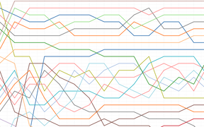
The story of 2015’s Kexreið
Visualisations
Sixty riders jostle for position in a 30km criterium around Reykjavík’s city centre
-
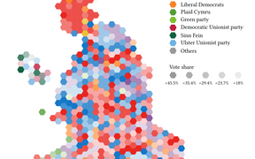
Who came second in the British general election?
Maps
Britain’s voters are more diverse than the election results suggest
-
The world’s top 100 universities, visualised
Maps
See how the world’s best institutions compare