The rise and fall in support for British political parties
Visualisations
How the distribution of the popular vote has been shared between Britain’s main political parties since the 1950s
The two mainstays of British politics, the Conservative party and the Labour party, have been the major parliamentary powers for a century. Not since David Lloyd George’s Liberal-led coalition fell in 1922 has any other party led a government. When in power, rarely has either party had to suffer the indignity of a coalition.
Seen as opposites of one other, with the Conservative party occupying the right-wing of British politics and Labour the left, it’s all too easy to assume that as one party’s power wanes, the other rises. But, given the winner-takes-all system used in Britain’s national elections, that doesn’t tell the whole story. In the 2005 election, Labour won 35% of the popular vote, the Conservatives 32% — yet Labour got 62% of the seats in parliament, the Conservatives’ 31%.
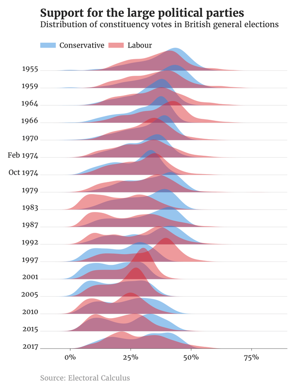
To try and understand the distribution of the popular vote for these two parties, I reached for a visualisation called the ridgeline plot. Looking like nothing more than gently sloping hills, they’re useful for visualising changes in distributions over time or space. (The first such plot was created in order to pick out patterns in radio signals emitted by pulsars. It was later used on the cover of Joy Division’s debut album, Unknown Pleasures.)
The chart is a variation on a histogram. It shows us the spread of each party’s share of the vote in every constituency for each election. The peaks help show us where values are most concentrated in each election. In the 1964 election, for example, the Conservative peak around 38% tells us their constituency vote clustered around that level.
Up until the 1980s, both parties had a long tail: a large number of constituencies with a low vote share, where the vote faded slowly away from the main peak of the distribution. In more recent elections this long tail has changed into a second, smaller, peak — the distribution becomes almost bimodal. I wonder if this is an indication that the parties have become better at categorising constituencies: don’t put time and money into that constituency, the data tells us it’s unwinnable. That sort of thing.
As for the story the data tells, the 1980s stand out: Labour in its wilderness years during Margret Thatcher’s long rule; the Conservatives strong throughout. Later, Thatcher is ousted and Labour surge back under Tony Blair. But from the Himalayan peak of 2001, Labour’s support diminishes. Now, we’re left not with mountains, but with distributions that look like hats left forgotten on a train, crushed under the weight of an inattentive passenger.
The code is available on GitHub. It uses Hadley Wickham’s ggplot2 package for the R programming language, and Claus Wilke’s ggridges extension. The data came from Electoral Calculus.